NATIONAL CENTER FOR
TELEHEALTH & TECHNOLOGY
User Experience, UI, Interactive, and Prototype Design.
|
THE PROBLEM
The U.S. Department of Defense has a very large population of returned soldiers who need psychological resources. I was tasked with leading the over all design and flow of an enterprise-wide website for mental well-being of soldiers, their friends, and family members. |
THE SOLUTION
The designs span 4 years and the work continues. The solutions seen here are still in development, and refinement continues to this day. Descriptions are provided for some guidance and perspective. |
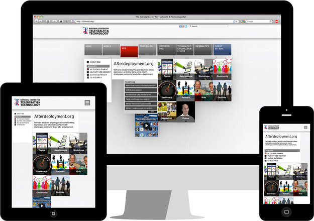
2011
Description: The format of the overall design is using the grid to push content from the individual “epic” areas of expertise of AfterDeployment.org (DoD — Health Hub).
An “epic” is content from an expertise area. So as each service branch would have their own “epics” (Army, Navy, Marines, etc.) they could/would add “epics” as they became available. (i.e.—Home, Telehealth, Web, Mobile, etc.)
Here I’m showing the “Web” section as this section would have a number of shared “epics” among service branches. The “Home” page would be slightly customized for each service branch.
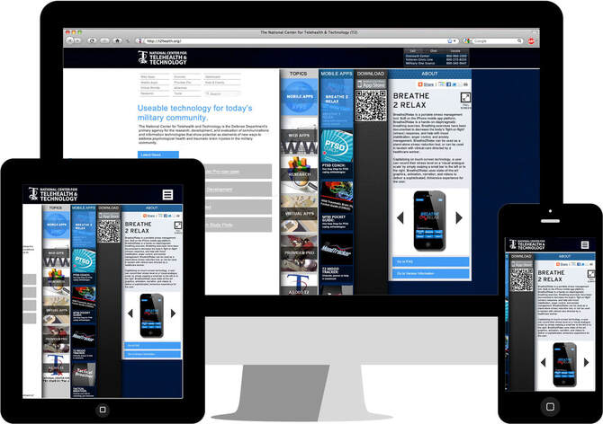
2012
Description: In 2012 we began to experiment with a navigation approach that you literally were “sliding” out “drawers” of information on whatever you “touched” or “clicked”. There would be a slight animation to get the user to know that these “drawers” were navigational content. As the previous layout suggests, each service entity would have their own set of “epics” that would fill in the content of their technology health website.
Note: On the tablet and mobile versions of the site we are also working with an ability slide/ swipe content left to right.
Note: On the tablet and mobile versions of the site we are also working with an ability slide/ swipe content left to right.
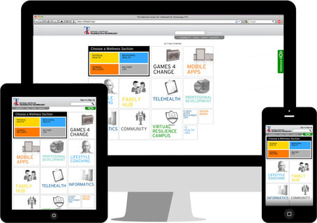
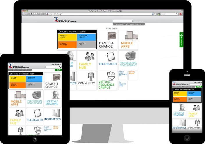
2013/2014
In 2013 a number of Joint Chiefs of Staff from the U.S. Department of Defense along with the Military Health System (MHS), were excited about what we were doing and they began to have input over how the structure of the site worked. Along with the data showing that smaller desktop monitors were becoming increasingly popular, we wanted to maximize the overall use of the mobile and tablet version of the site as our target demographic was projecting 50% of primary usage. Included with this layout we did an entire dashboard process (green tab on the right of the desk- top version and on the top of the mobile/tablet versions), that Military Health Systems would be able to fill with patient information.
SUMMARY
As you can see through the last few years, traction has continued, and support of the project increases as time has gone on.
With the added support, many more hands have continued to want to push their ideas into the project. This does slow down the process, but the increased communication has brought the DoD more thoughtful overall designs, and shed light on a number of health organizational data categorical is- sues the DoD has. Which they have communicated many times appreciation for.
All of these designs at an Enterprise-wide organization (Department of Defense) with thousands of moving parts to try to maintain visual design along with organizational design was exceptionally challenging, and very rewarding.
TEAM
|
DESIGN LEAD:
Craig Wright |
TECHNICAL LEAD:
John Baldwin |
PROJECT HEAD:
Dr. Rober Ciulla |
|
SCRUM / PM LEAD:
Bob Miller |
iOS/ANDROID LEAD:
Matt Higgins |
T2 / MHS LEAD:
Dr. Julie Shekter-Kinn |
|
LEAD SME
Dr. Kelly Blasko |
LEAD COPY
Dr. David Cooper Patience Veloza |
UX TESTING & RESEARCH
TEC |

